
 World Series
 Hats
Hats Shirts
 Jerseys
One of the oldest baseball teams in the National League, the Chicago Cubs have had over 15 logos throughout their more than 40-year history. Some of the emblems are absolutely unlike one another, yet what almost all of them have in common is the stylized letter “C”.
Meaning and History
![]()
Though the visual identity of the Chicago Cubs baseball club has undergone through more than a dozen redesigns throughout the years, they have all been backed on one main symbol, the letter “C”, which was used on its own in the very beginning, and later got some additions, changing from year to year.
1903 — 1905
![]()
The initial logo for Chicago Cubs was composed of a single blue “C” written handwritten in a gothic style with thick rounded lines. It was a simple yet bright emblem, reflecting the character of the club and its expertise.
1906
![]()
In 1906 the “C” was redrawn in a traditional serif typeface and a darker shade of blue, with the clean round line of the letter and a massive rectangular serif on its upper edge.
1907
![]()
In 1907 Chicago Cubs adopted a wishbone-style letter “C” as its primary logo, and slightly switched the shade of blue again, making it just a little bit lighter and calmer. The new emblem looked elegant and modest, yet showed the mood and spirit of the baseball club.
1908 — 1915
![]()
The redesign of 1908 brought new symbols to the Chicago Cubs’ visual identity. It was a broken silhouette of a bear standing and holding the baseball bat. The image was placed inside a bold and neat letter “C” written in a modern sans-serif, using a dark blue color.
1911
![]()
In 1911 the bear turned navy blue, just like the letter “C”, wrapped around the animal. The image now looked sleeker and balanced. And the new simplified blue and white color palette was evoking a sense of stability, professionalism, and quality. Quality in everything — from the game to the visual identity. Also, without the light cream outline, the bear got its contours looking cleaner and more distinct, which added power and masculinity to the overall logo.
![]()
In 1916 the bear was redrawn in blue, and now it was walking in his four legs inside a red wishbone “C” with a thick blue outline. The new color palette looked powerful and added a sense of danger and determination to the club’s identity, while the bear represented the character and fundamental approach of the Cubs to the game.
1917
![]()
The redesign of 1917 simplified the Chicago Cubs logo to a two-leveled logotype executed in calm blue using a square and modern serif typeface. The “Chicago” in capitals was arched above the straight line of “Cubs” with all letters capitalized as well. It was a simple yet professionally executed logo, which only stayed with the club for a few months.
1918
![]()
In 1918 the club introduced a new badge — a square outlined “C” with its horizontal bars elongated and bent towards the center and and “UBS” in blue placed inside it. The lettering was executed in a smooth square sans-serif with wide solid shapes of the letters.
1919 — 1926
![]()
The wishbone “C” comes back to the Cubs’ visual identity in 1919. Being outlined in blue, the letter had a bold handwritten “UBS” in smooth thick lines placed in its middle. The blue of the inscription balanced the blue of the “C”s outline and made the composition complete and harmonized.
1927 — 1936
![]()
In 1927 the “UBS” lettering was replaced by a blue bear’s silhouette, just like the one from the 1908 version, with the baseball bat in his hands, but with cleaned and refined contours and in a smaller size.
1937 — 1940
![]()
The predecessor of the current Chicago Cubs logo was created for the club in 1937, based on several previous versions. The new badge was composed of a bold red letter “C” in a delicate blue outline with the blue “UBS” lettering placed inside it. The “C” was executed in a simple sans-serif typeface and featured a perfect circle shape. As for the additional lettering, it was also written in sans-serif, with thick blue lines and slightly squared contours.
1941 — 1956
![]()
All the elements of the logo were colored red in 1941. The composition was placed on a white background and outlined in thin blue, repeating the contours of the elements. As for the typeface and style of the “C” and the lettering changed they remained almost unchanged.
1957 — 1978
![]()
In 1957 the outline becomes circular, which makes the logo look balanced and more confident. The red and white combination, enclosed in a thin blue frame looks powerful and evokes a sense of professionalism, energy, and determination.
1979 — Today
![]()
The lines of the Chicago Cubs logo were refined again in 1979. Keeping the shapes and style of the previous version, all the contours of all the elements were thickened and now the blue outline turned into a wide solid frame, and the inscription inside the “C” got enlarged and emboldened.
Emblem
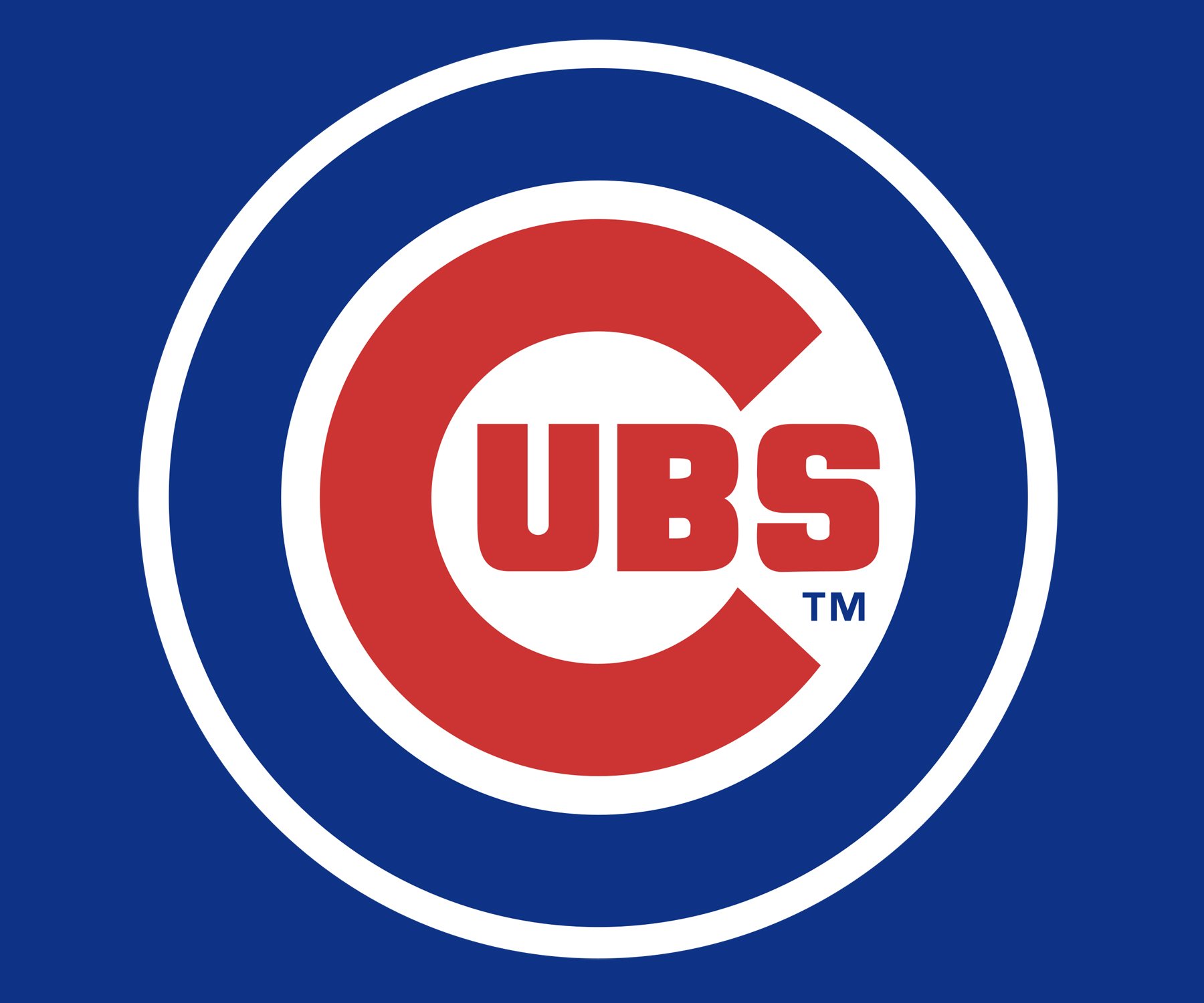
The 1918 symbol was the start of a new era. It was the very first Chicago Cubs logo where the letters “UBS” were placed inside a big letter “C”. Although there have been quite a few amendments to the shape and size of all the letters, on the whole, the idea has remained the same until now. The only periods when another logo was used were from 1927 to 1936 and from 1941 to 1945.
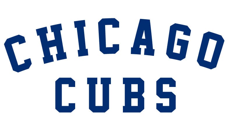
Font
![]()
The word “Cubs” is given in a simple bold font looking clean and solid. There were quite a few other typefaces used in the previous versions of the logo.
Color
![]()